The Libraries Numeric Data Catalog Holdings has some interesting data on the United States election results starting from 1912 to the most recent election year. Included are data on not only the presidential elections, but also gubernatorial, senatorial, congressional, and special senatorial elections.
The source of the data is Dave Leip’s Atlas of U.S. Presidential Elections, which you may already be familiar with. If you’re not, it’s a source that major news sources like The Atlantic and The Wall Street Journal, and The New York Times, have used for election reporting.
There are some fascinating things you can discover with the data sets. The following are some findings on the most recent presidential election in 2016.
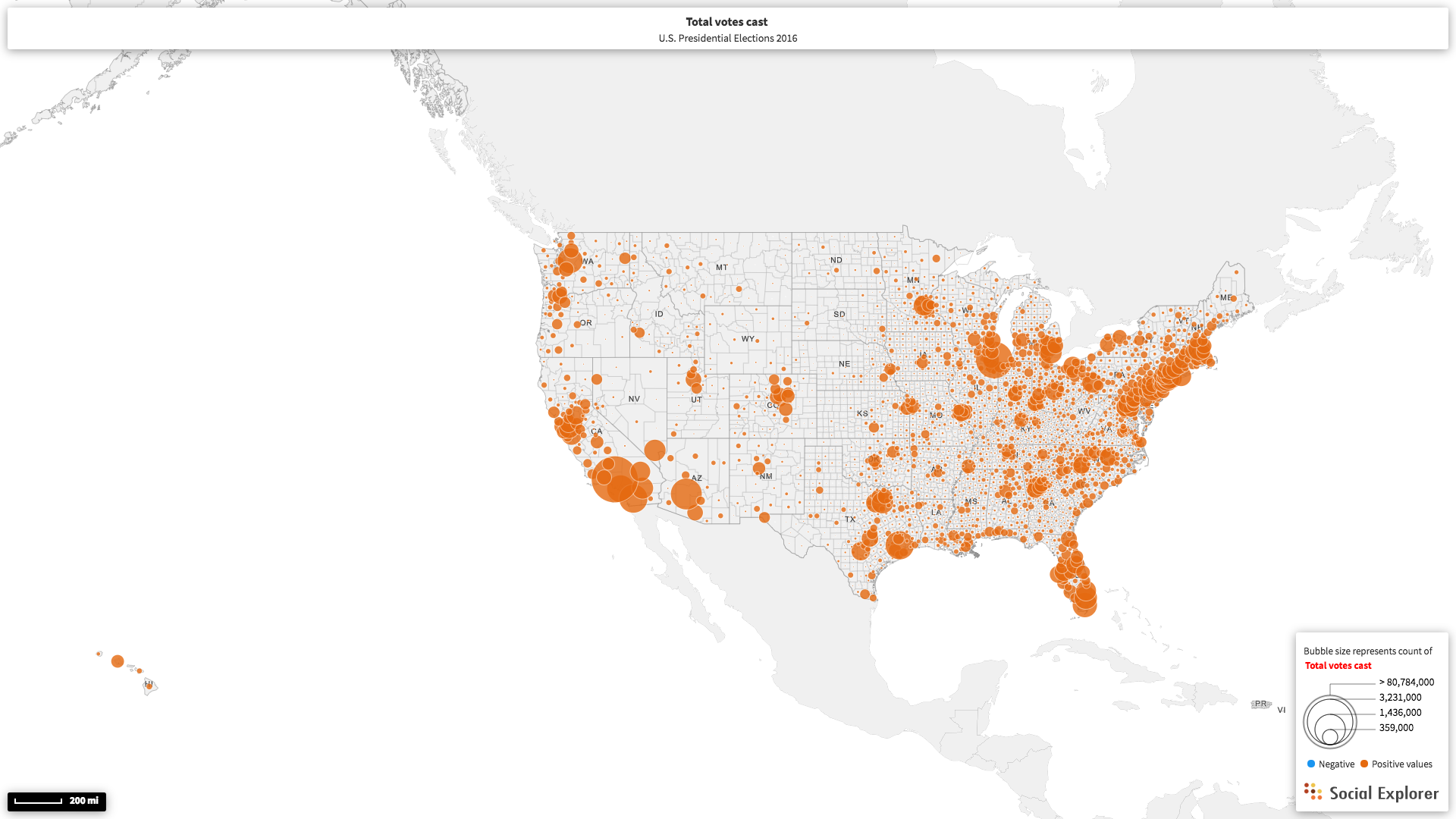
Here is a visual representation of the total number of votes cast by state:

And here, we can see the total number of votes cast by county across the country.
Below, we have separated the Republican and Democrat votes and have displayed them by county as a percentage of the total votes per county.

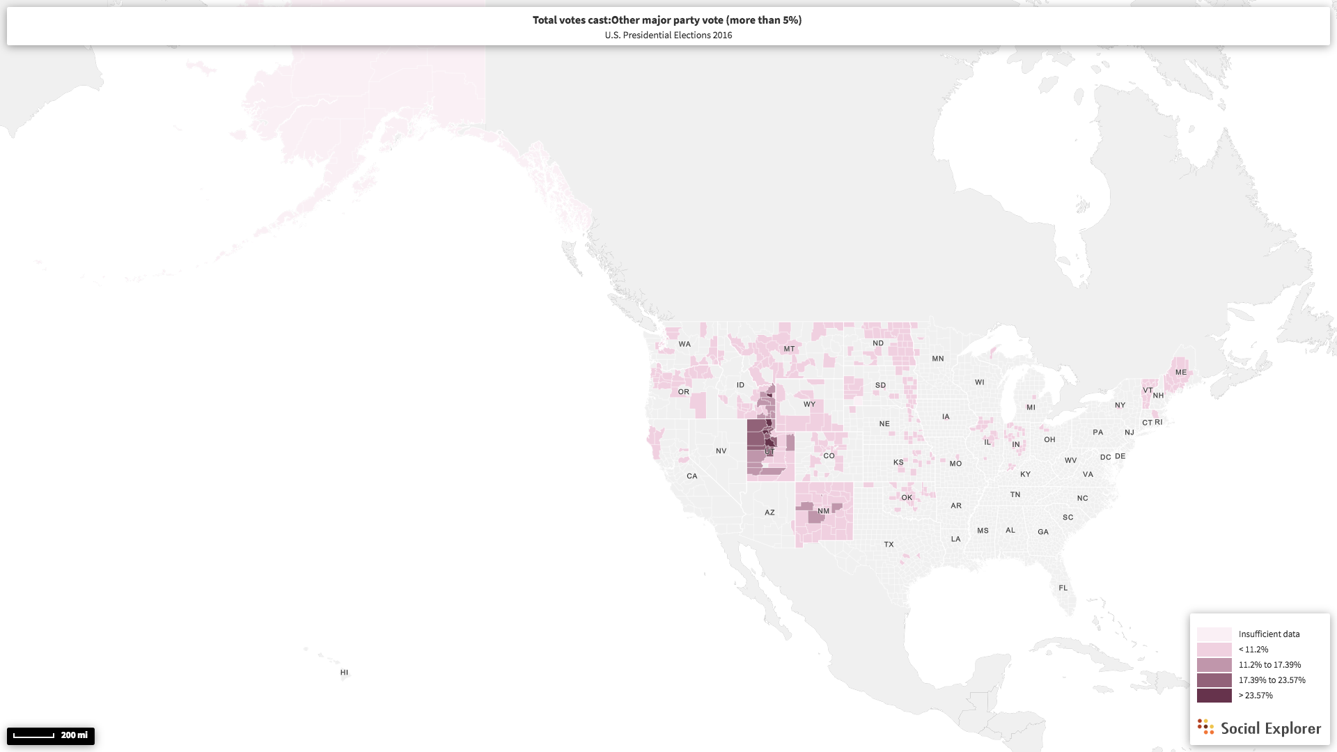
The data also has information about other presidential parties that received more than 5% of the total votes. We can see here, that in several counties around Salt Lake City, Utah, had around 20% or more of their total votes go to a candidate other than those supported by the Republican or Democrat parties.
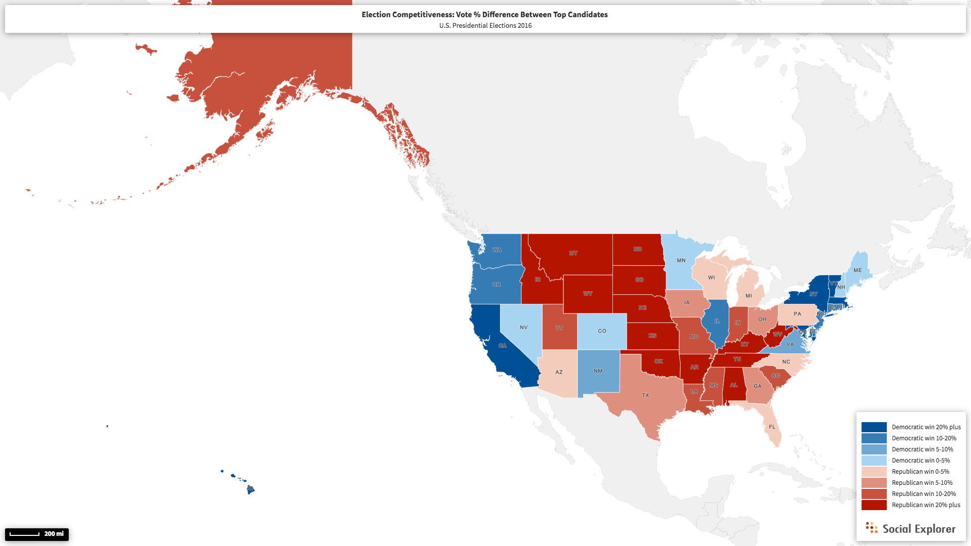
While total counts are useful and necessary information, we can do even more insightful things using this data set. One thing we can do with the data is see the differences in the percentage between the top candidates, also called “election competitiveness”, by state. For example, the Democratic candidate won California with a margin of over 20%, and in Pennsylvania the Republican candidate won by a slim margin of 0-5% of the votes.
Here is the election competitiveness by county across the 48 contiguous states:
and again, by county:

Since the data goes back all the way until 1912, let’s compare this information with a couple of the past recent presidential elections.
Here’s the election competitiveness by state in the 2012 presidential elections compared to 2016:

And 2008 compared to 2016:

Just for fun, let’s take a look at the election competitiveness of the states from the election 20 years prior to the last one, in 1996.

As you can see, this data set is very relevant and has plenty of intriguing information for those who are looking to do compelling analysis on U.S. elections.
The data includes detailed information such as the candidate names and party ballot listing per state, a national summary which summarizes vote totals by state for each candidate, and even data for New England towns (ME, MA, CT, RI, VT, NH) for those focused on election data of a particular town in the Northeast. You can read more about the what is included in this study, at it’s README file here.